The Stonewall Uprising
An informational project on the history of The Stonewall Uprising
Objective
*
Objective *
This project is aimed to educate the general public on the Stonewall Uprising of 1969, which marked a new beginning for the LGBTQ+ rights movement in the US and across the world.
Queer history is often left out of our public education, leaving many unaware of the struggles that the LGBTQ+ community has faced for decades. By sharing the story of queer revolutionaries like Marsha P. Johnson and Silvia Rivera, this project shows that LGBTQ+ people have always and will always exist.
Project Scope
*
Project Scope *
Ideation
Research
Illustration
Photo Editing
Brochure
Process
*
Process *
I started this project by researching the Stonewall Uprising and the events leading up to it, searching for images and news clippings covering the night of June 28, 1969, and the following protests. I looked for relevant art styles to the time and movement as well.
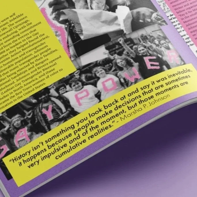
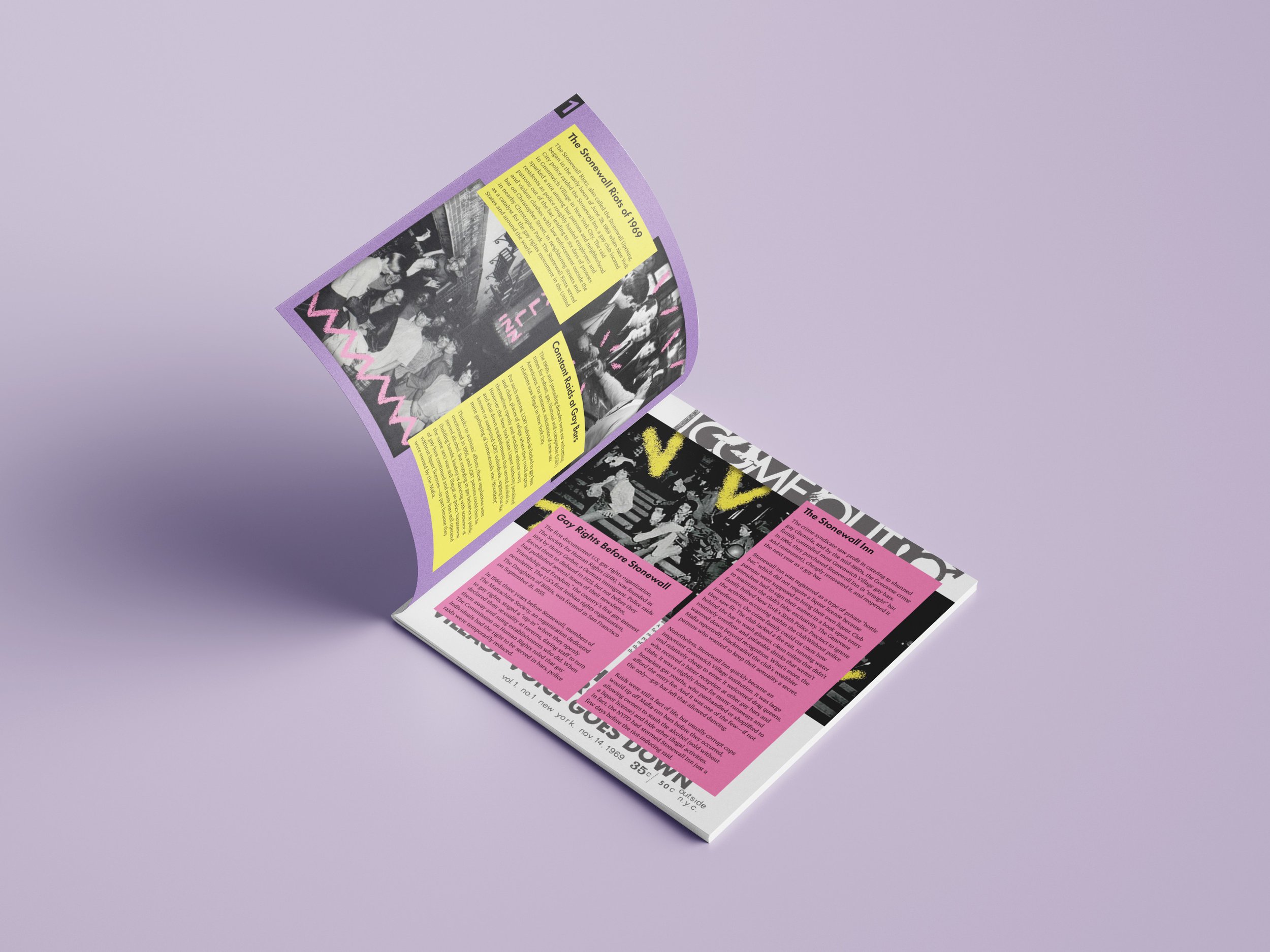
Using these, I developed bold, bright, hand-drawn elements to accompany the black-and-white images in the brochure. Instead of choosing rainbow colors, common in designs for the LGBTQ+ community, I chose three bold colors to use throughout to avoid drawing too much attention from the powerful images.
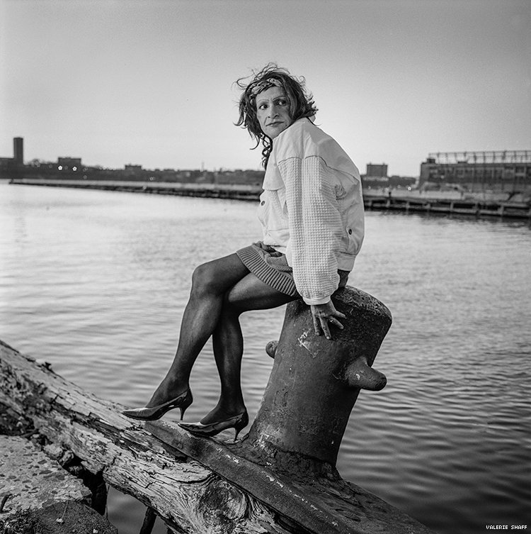
Once I chose my design elements, I formatted the brochure to inform readers how the LGBTQ+ community was treated in the years leading up to the night of the Stonewall Riots and the effects it still has on this community today. The story would not be complete without paying tribute to transgender revolutionaries Marsha P. Johnson and Silvia Rivera, who both played huge roles in the fight for LGBTQ+ rights in the US.
Inspiration
*
Inspiration *
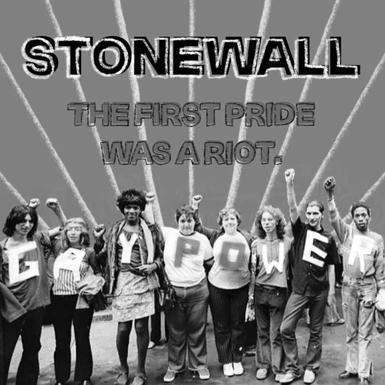
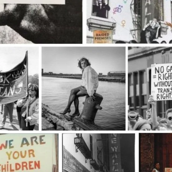
I was inspired by the powerful black-and-white images taken during the Stonewall Uprising and at the marches and protests that followed. I utilized news clippings, ransom-style letters, hand-drawn graphics, and bright, bold colors to develop a punk, zine-like aesthetic.
As queer history is often left out of traditional education, it was important to me that this brochure represented the energy and power of queer resistance throughout the design.
Cover Design
*
Cover Design *
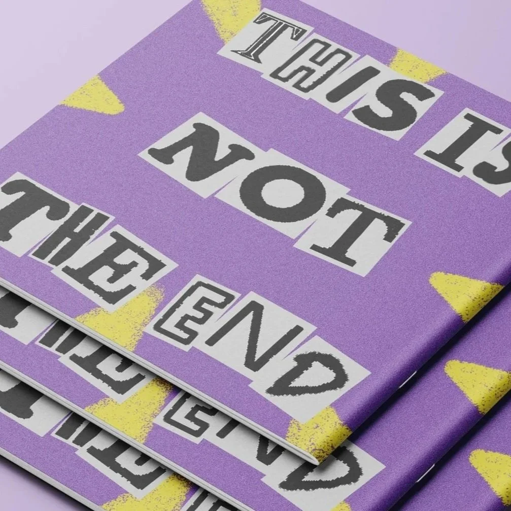
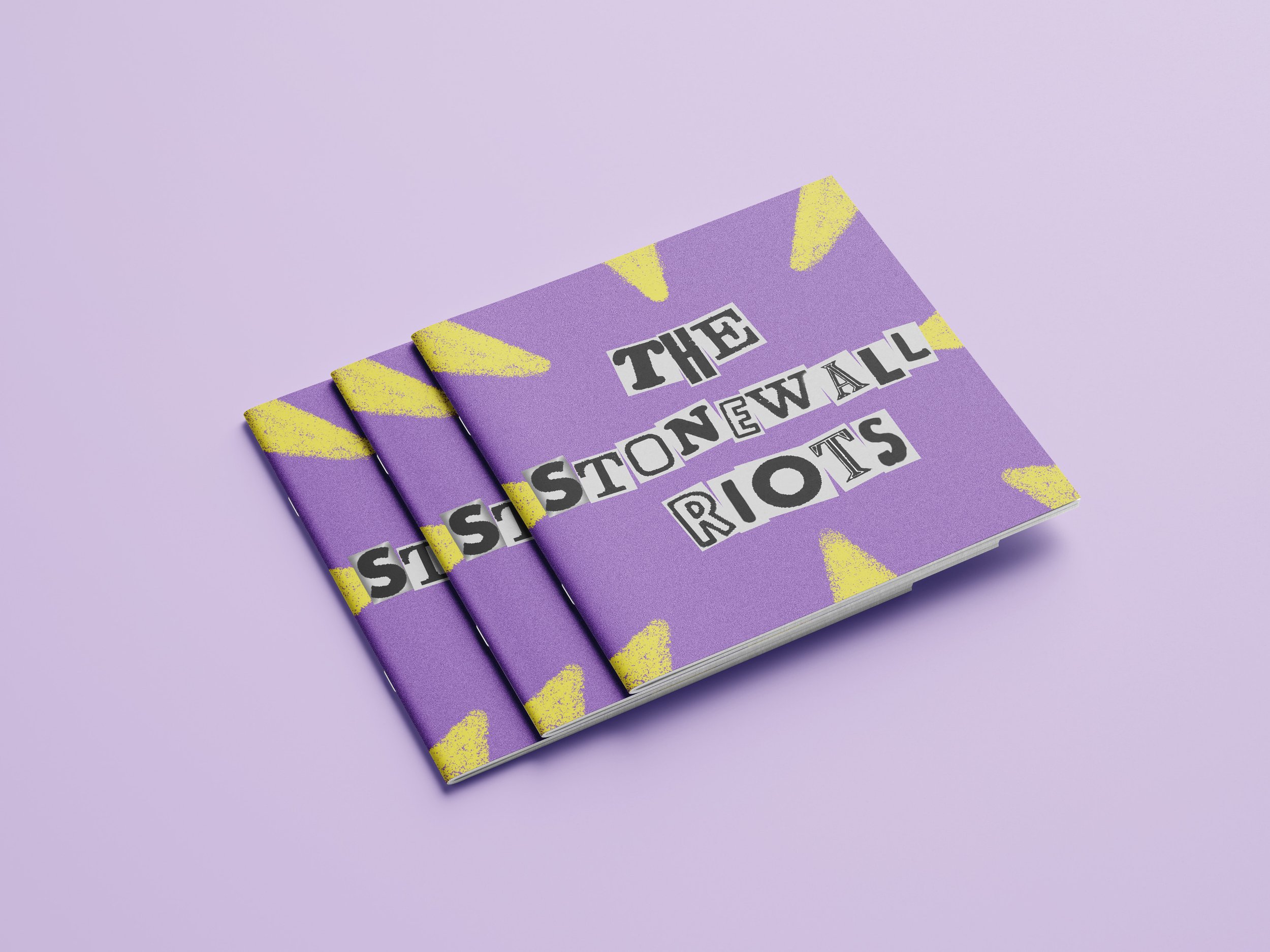
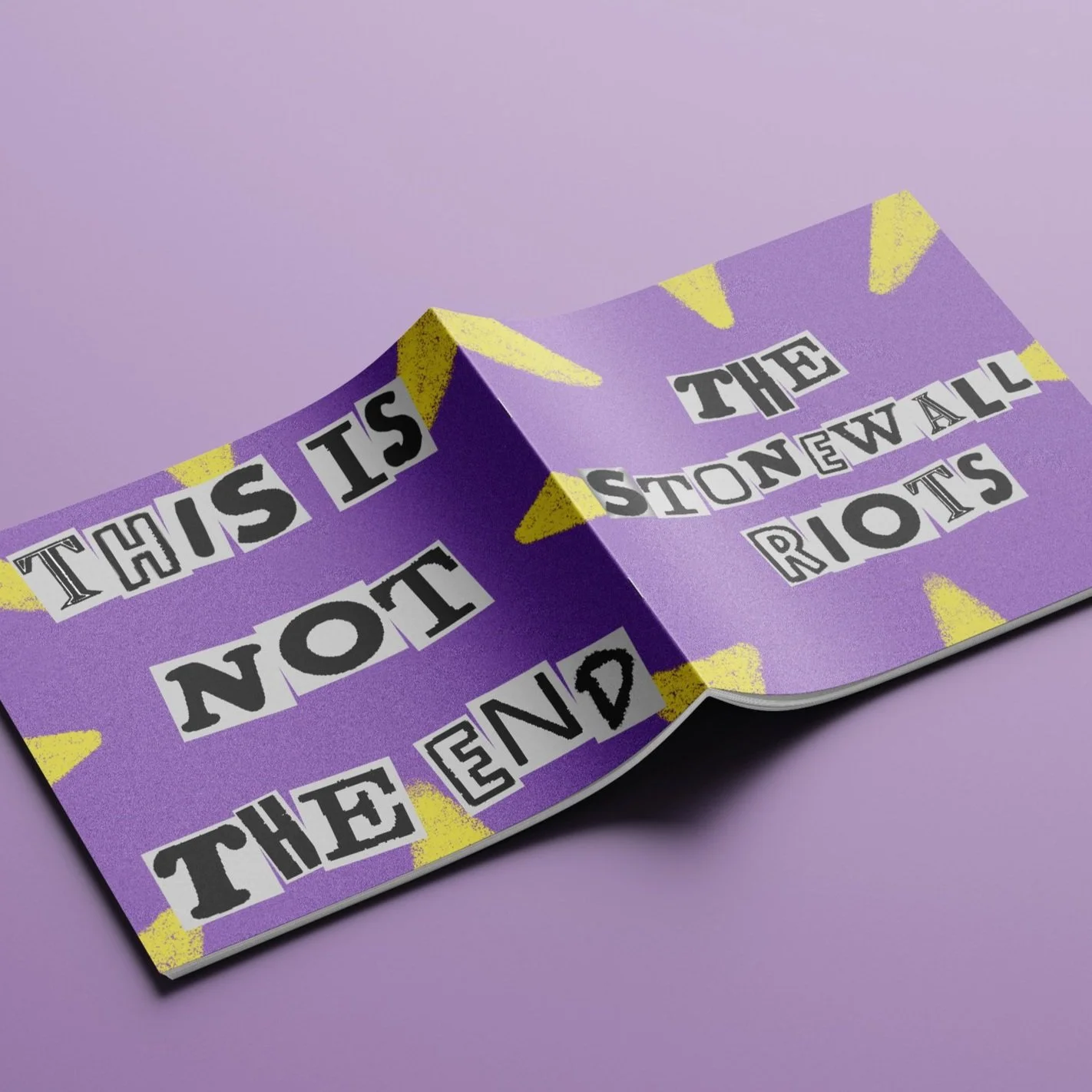
After gathering the historical assets to be used, I was further inspired by the different styles of typography used in the news clippings, protest posters, and march banners. I designed the front and back covers using letterforms from photographs in the brochure, creating a ransom letter-style message surrounded by bold hand-drawn graphics. It’s intended to demand the reader’s attention and scream “SEE ME!”. This reflects the intentions of the LGBTQ+ community when fighting for fair and equal human rights, to be seen and heard.
Page Design
*
Page Design *
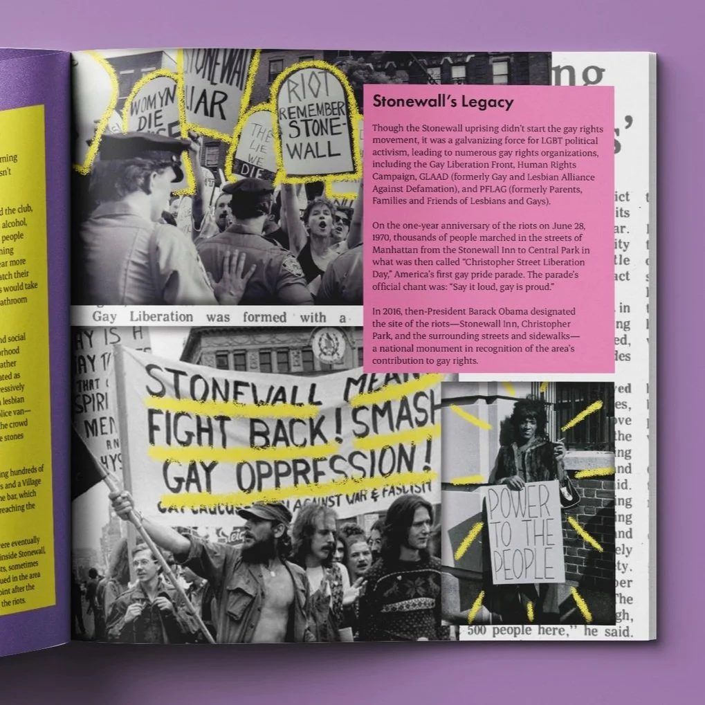
When designing the layout of this brochure, I wanted it to take the reader through a story of what it was like for a queer person living in the US in the years before Stonewall. Using the provided article, I chose images and news clippings that follow the article chronologically. I layered the news clippings, photographs, and hand-drawn graphics to create depth and organized chaos, much like many queer magazines and newsletters published in the 1960s and on. Utilizing the same bold purple, pink, and yellow throughout creates consistency for the readers, while the layout and graphic changes draw them in further.
The Stonewall Uprising was only the beginning.
The fight for LGBTQ+ Rights continues today.